Pulse
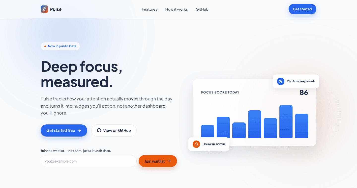
Personal concept, UI and motionAn animation-heavy landing page concept for a fictional focus-tracking app, built to explore scroll-linked motion design and accessible animation.
Architecture
Problem
Heavily animated landing pages often become inaccessible or janky in practice. Motion that looks impressive on a fast desktop can break down on mobile, ignore users who have asked for reduced motion, or feel like a demo reel instead of a considered interface.
Solution
Built a fully animated marketing landing page for a fictional focus-tracking product: scroll-linked reveal animations, a staggered hero entrance with an animated stat panel, and a working waitlist form with inline validation. It has full prefers-reduced-motion support throughout, so the experience degrades gracefully instead of breaking.
Technology
Key Features
- Scroll-linked reveal animations across every section
- Staggered hero entrance with an animated stat panel
- Full prefers-reduced-motion support throughout
- Working waitlist form with inline validation and success state
- Fully responsive, no horizontal scroll from 375px up
What I Learned
Building animation that respects accessibility settings by default rather than as an afterthought, and how much timing and staggering affect whether motion feels polished or just busy.